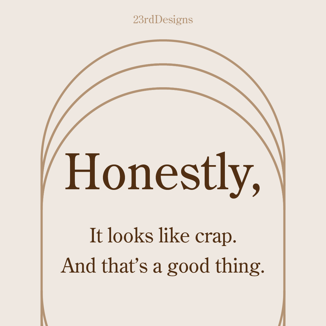
Design is not just what it looks like and feels like. Design is how it works.
Steve Jobs
Yes, you read that correctly. I really like your work, and I’m inspired by you and other artists/designers to create more of my own work. Your craftsmanship and attention to detail is admirable. The medium, choice of color, etc. It’s amazing. I love the way each of you use crap in your designs.
CRAP stands for contrast, repetition, alignment, and proximity. These principles can be seen everywhere from newsletters to mobile LED ads.
- C stands for contrast. This first principle is often the most important, as it differentiates and creates hierarchy within visual elements. Think of two different fonts, one circle that is larger than the other, or dark and light green squares.
- R is for repetition. Seeing a certain shape, amount of space, or color builds cohesiveness and sets expectations of quality for your customer. I like stripes, but other examples include title cards, using the brand palette across platforms, and the continuous use of elements. Picture polka dots or a row of hedges.
- A means alignment, and can be defined by the arrangement of things in a straight line, or correct position relative to a select point or area. An example of alignment can be the center justification of text.
- P represents proximity. It is the nearness of things in a given space. This principle would highlight the spaces between a group of circles.
Good designers are aware of the principles of CRAP, and great designers apply them thoughtfully. These are just four of the fundamentals I’ll be using throughout the development of our projects together.
Source(s):